Overview
This project aims to improve the experience of beginners to the gym by providing them feedback on correct body form so they don't hurt themselves while working out
Role
User Interviews, Cognitive Walkthrough, Competitive Analysis, Behavioral Profiles, User Flows, Visual Design, Interaction Design, Usability Testing
Deliverables
Wireframes, High Fidelity Prototype, Process Deck
Logistics
Softwares: Figma, Principle, Indesign, Photoshop
Duration: 4 Months
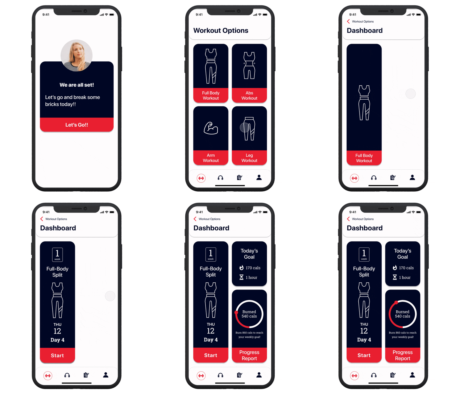
Build up confidence
Accessible design, Humorous text, personalized workouts, and progress reports will help the beginners to gain confidence
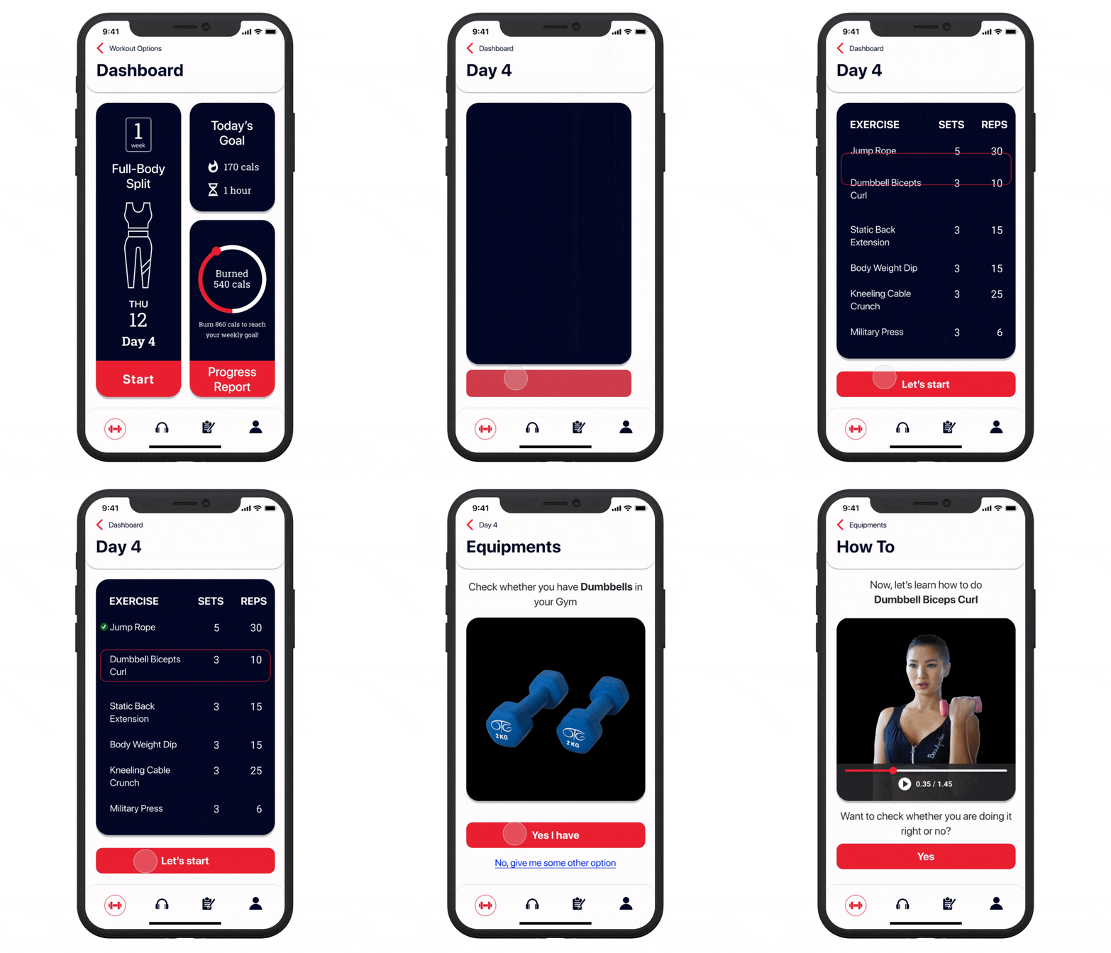
Don't know fancy gym equipments? No worries!
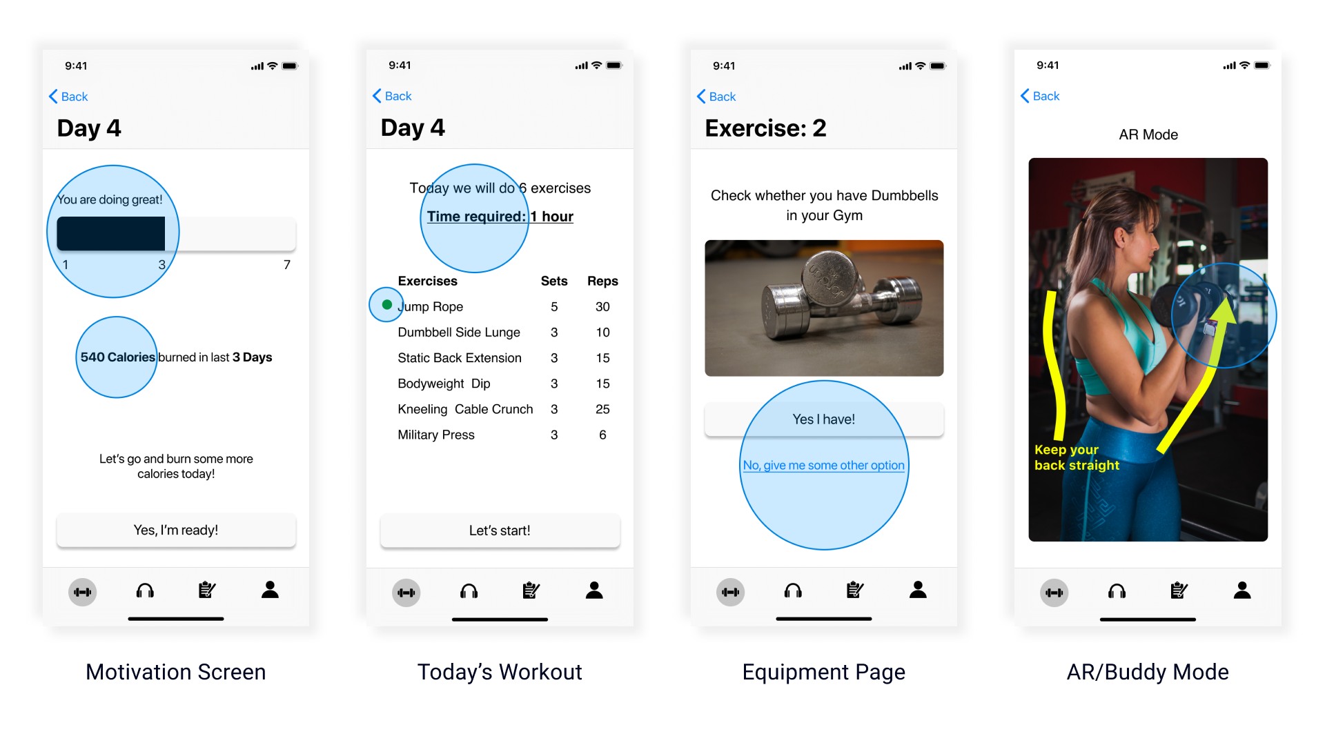
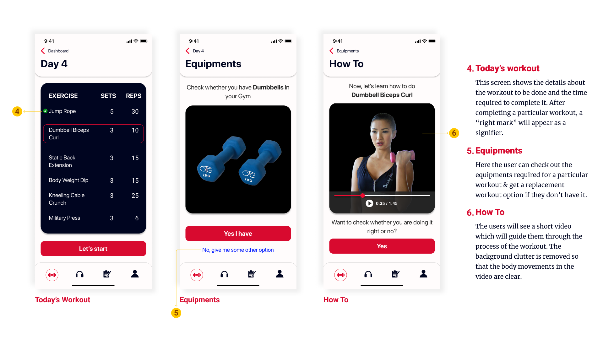
Finding equipment in the gym can be a good confidence breaker for the first-timers. But "Moves" have got you covered!
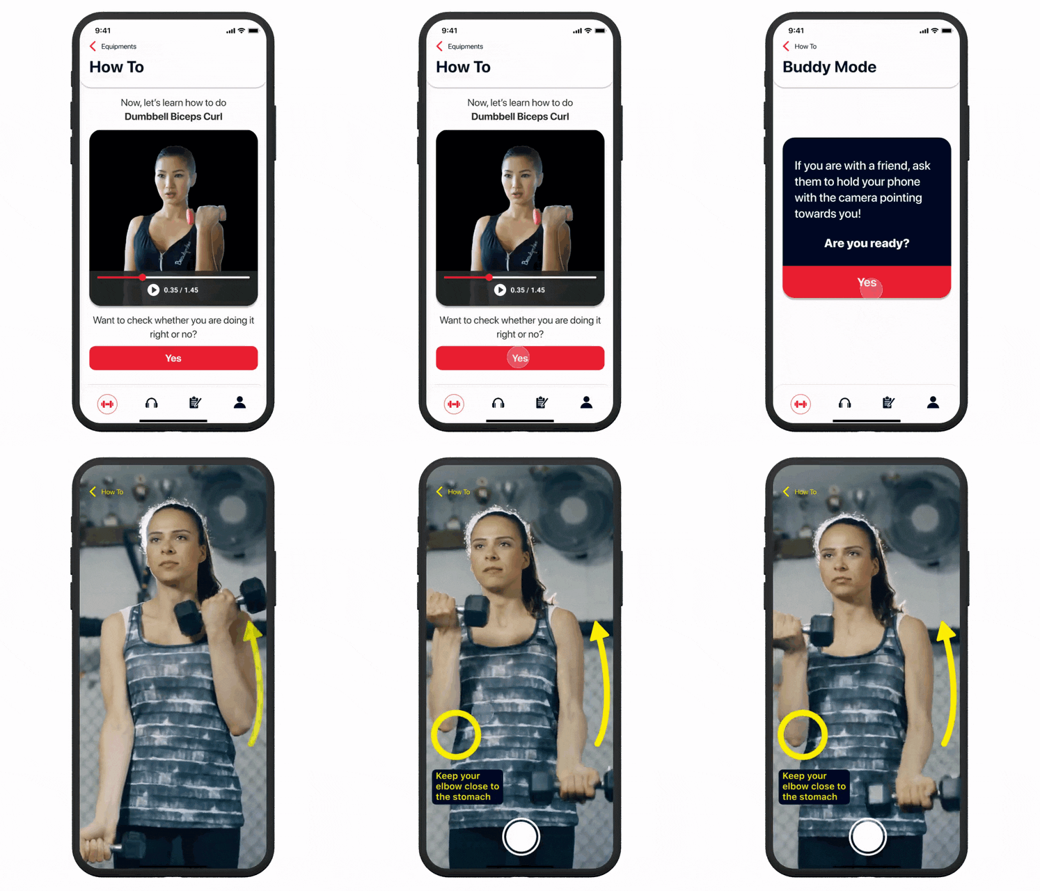
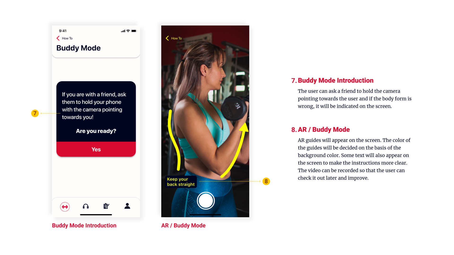
Get feedback on correct body form and postures
Use AR mode and get personalized feedback on body postures
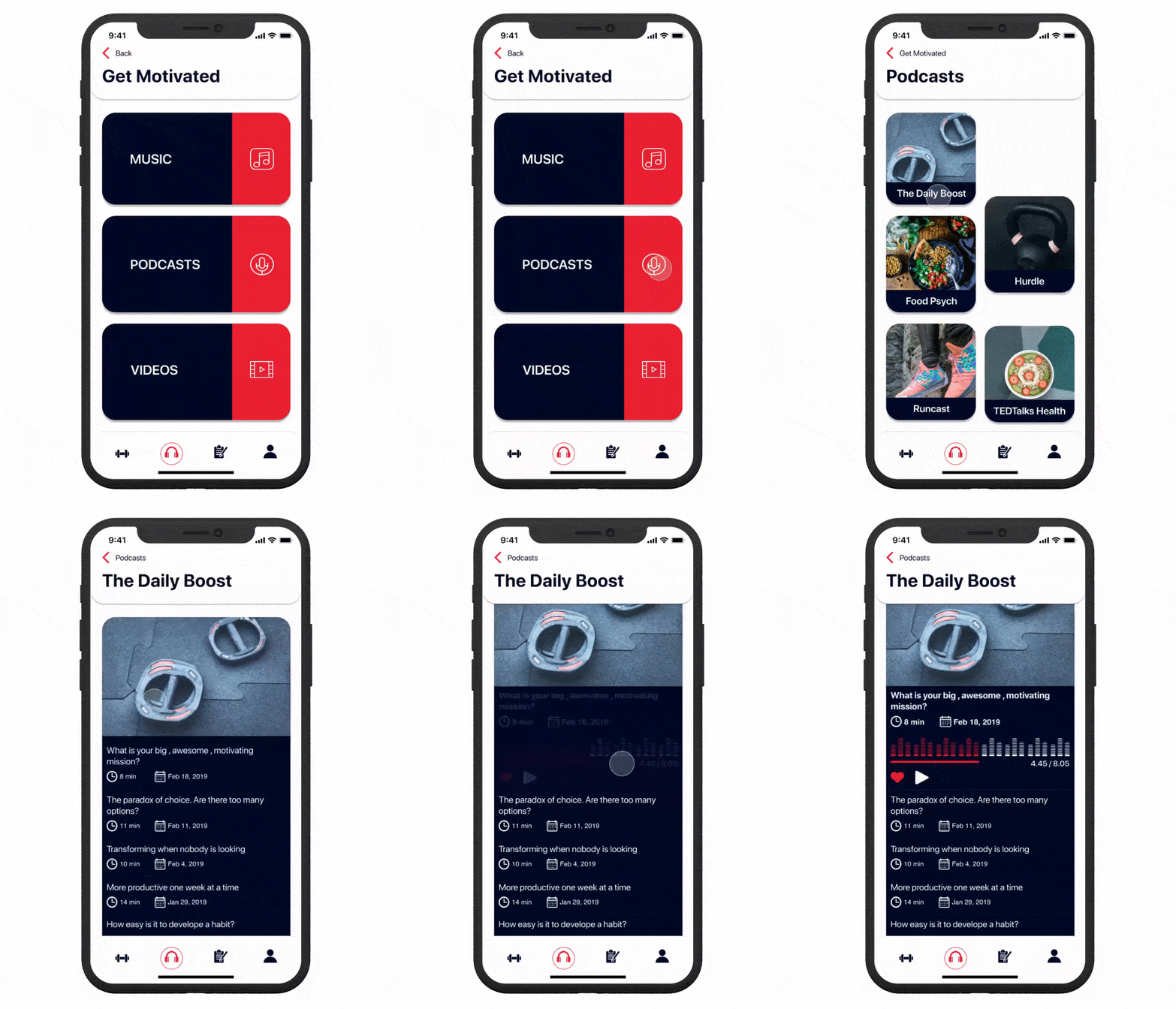
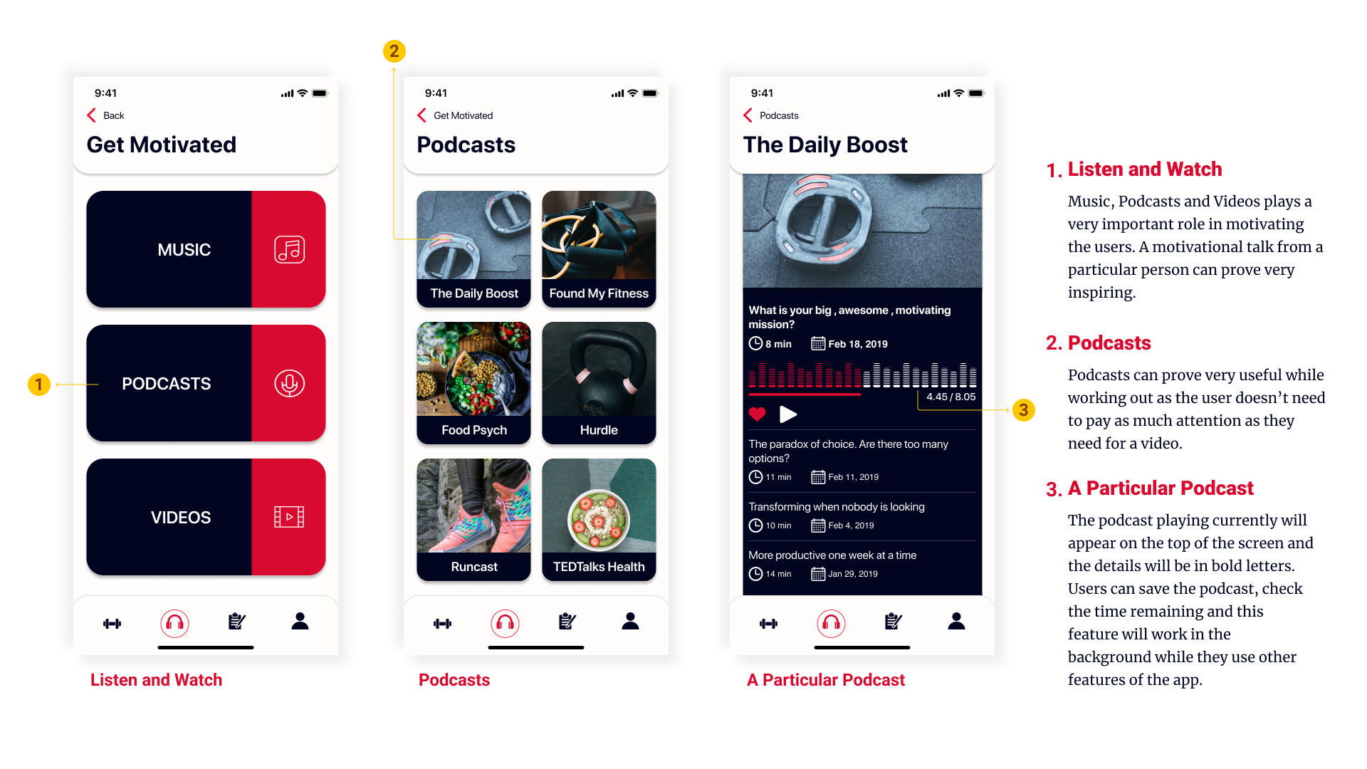
Get some motivation for a regular workout
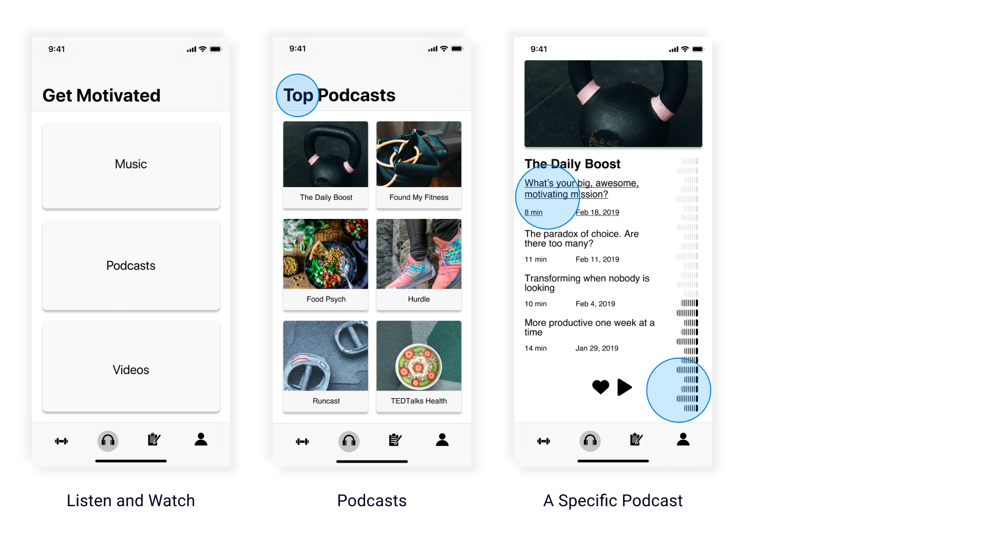
Listen to some energetic music or a motivating podcast from an influencer and get ready to work out!
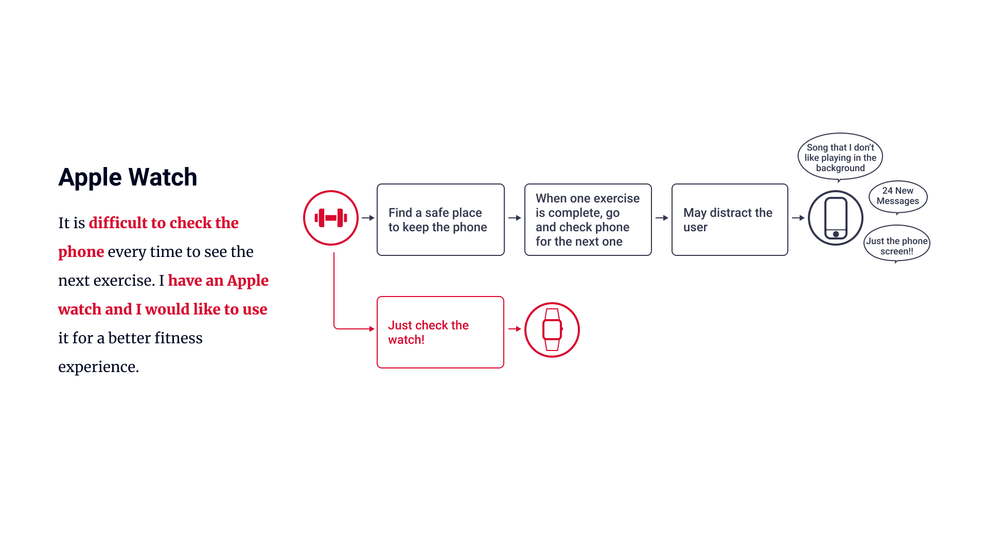
Phone is too disctracting? We've got solution!
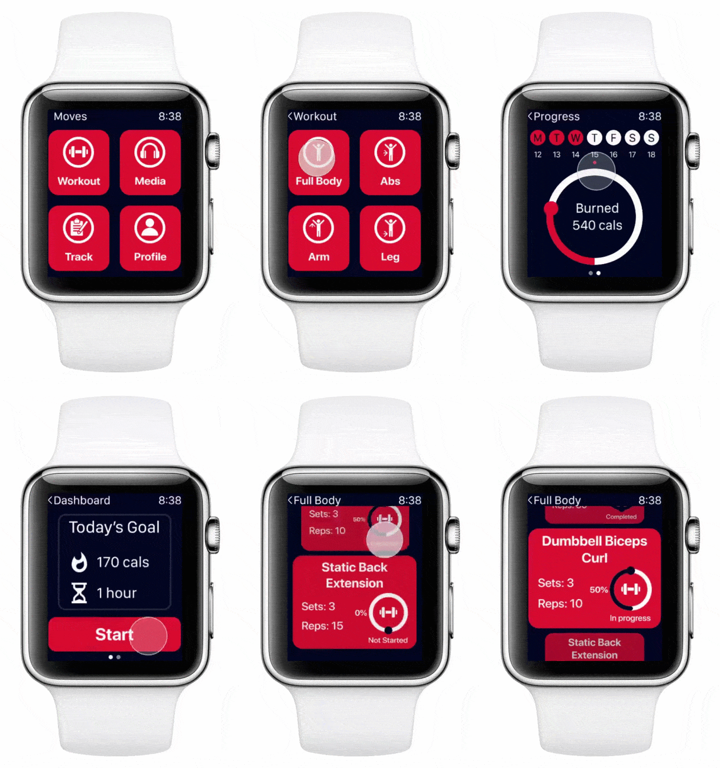
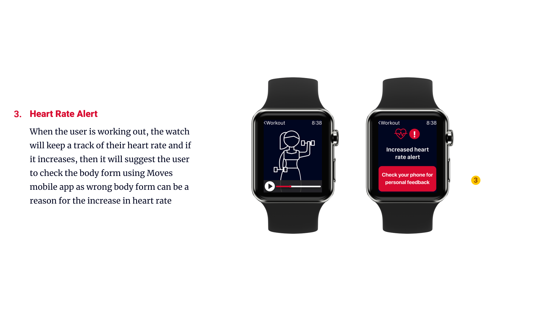
Apple watch will measure the heartbeats and if it detects some ups and downs, it'll recommend you to use the AR mode on your phone
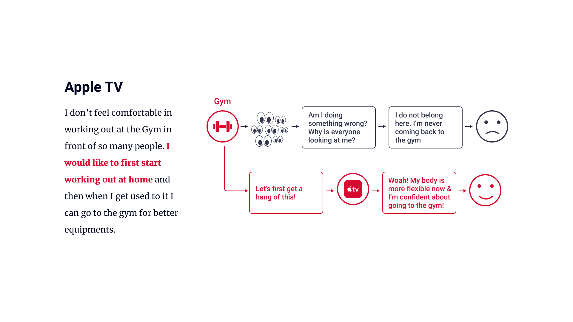
Not comfortable in working out at the gym?
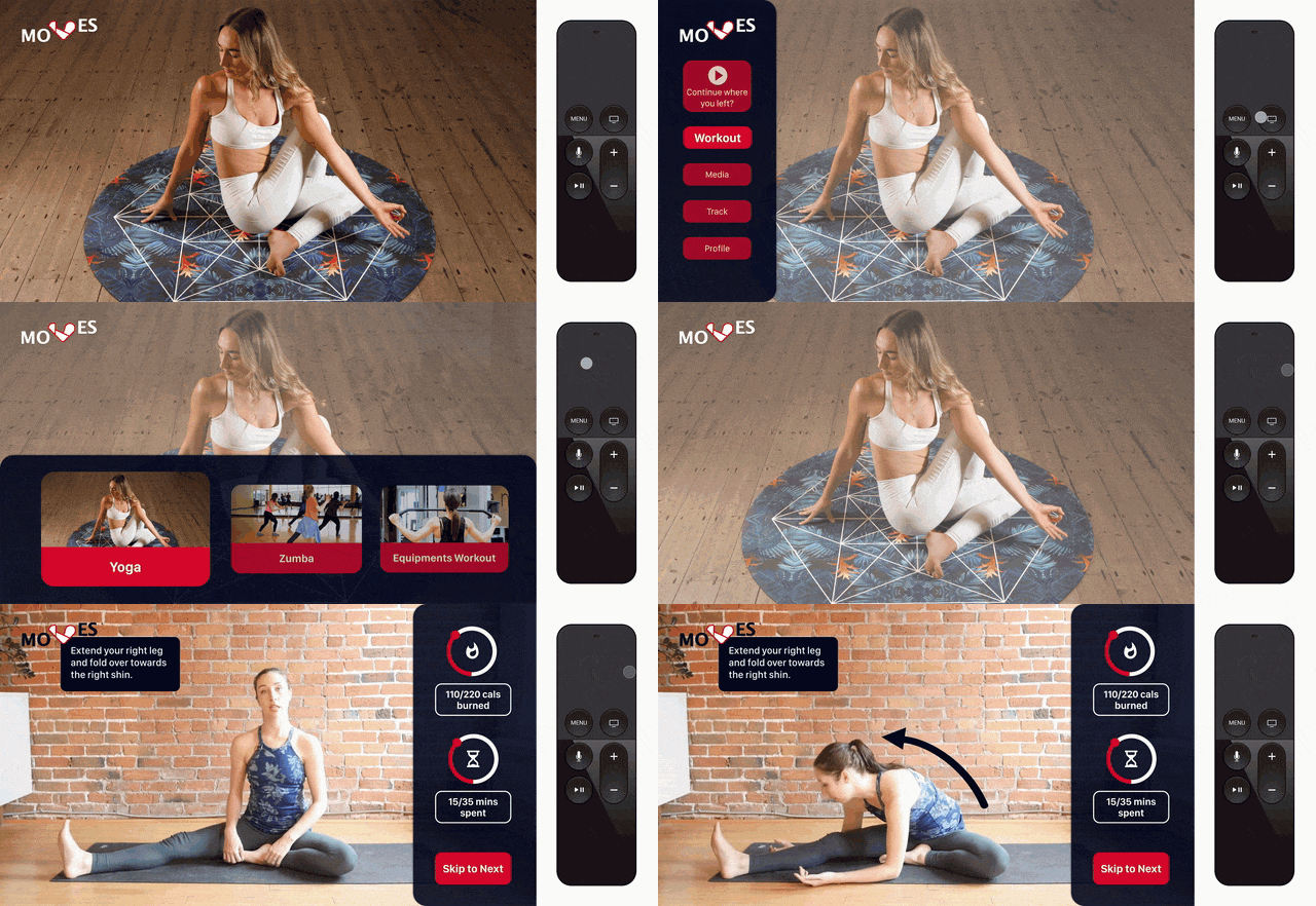
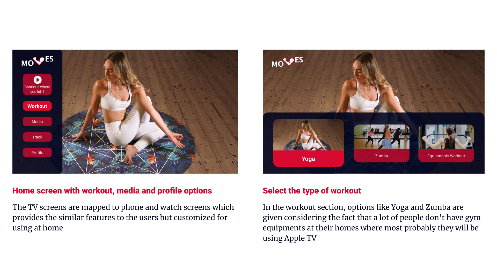
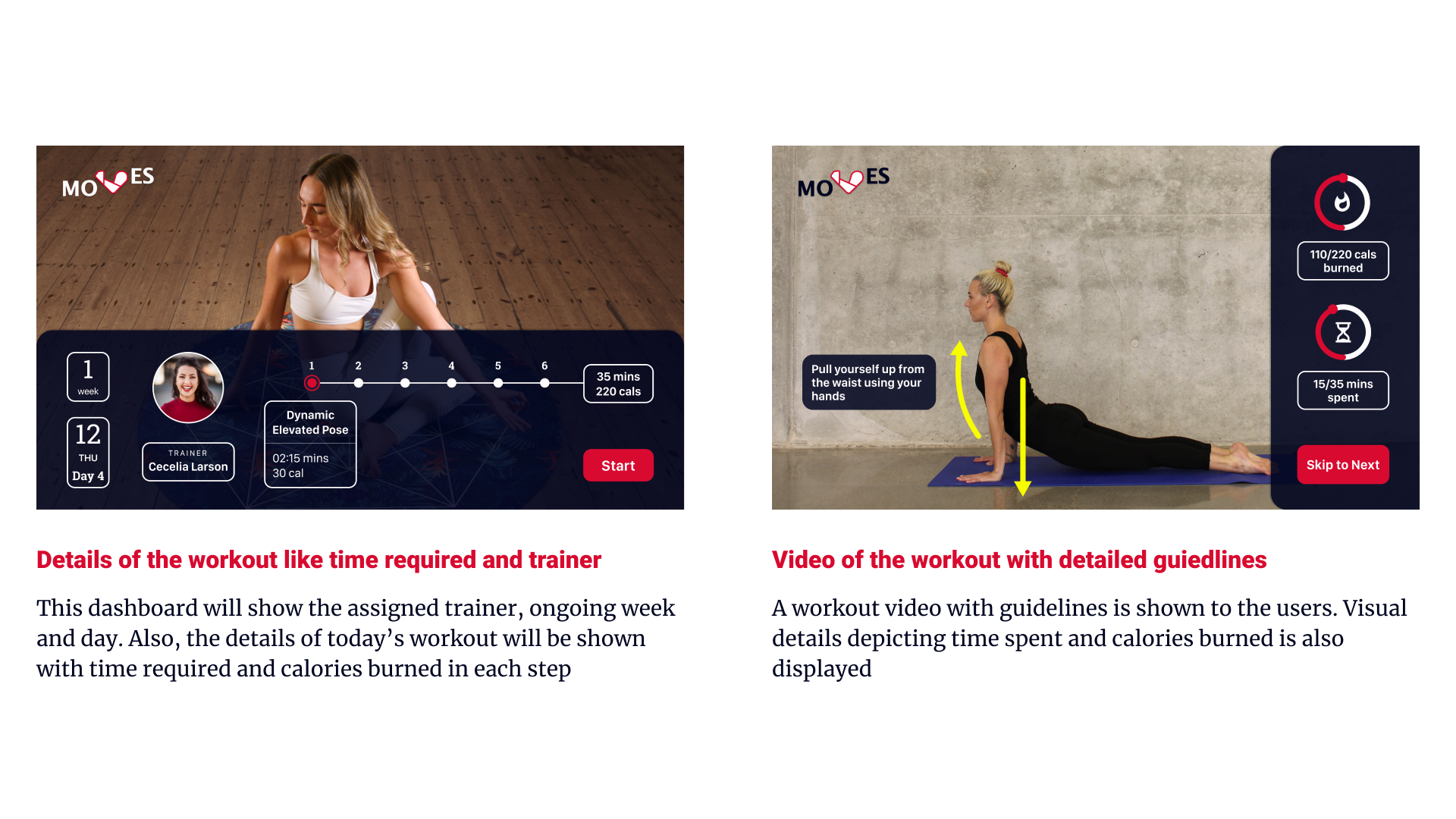
Checkout out workouts on Apple TV that can be done at home and when you're comfortable, show-off your moves in the gym!
Research
The initial research was divided into three parts, Observations, Content Analysis and Interviews
Observation and Content Analysis
I went to the Gym for 3 days to observe the general characteristics of people working out.
Some of the things that I focused on are
Are the people working out alone or in groups?
Are they using any gadgets?
How often people are asking questions at the information desk?
I analyzed the content from the AthleanX website and YouTube Channel and found out that they collect data from the users by asking 11 questions and provides them a paid workout plan accordingly. Random workout sessions are free on YouTube
Interview Insights
I took 7 interviews, 3 at the Gym and 4 at other locations. The key findings from the interview are as follows
When you are new, you need to know how your form is, how do you exactly work on the machine. Once you know how to do it, it doesn’t matter if the trainer is there
It’s good if you have a partner because they can motivate you and help you reach the next stage
Watched Youtube videos but I haven’t used any application
I have to wait sometimes because it is crowded
Behavioral Profiles
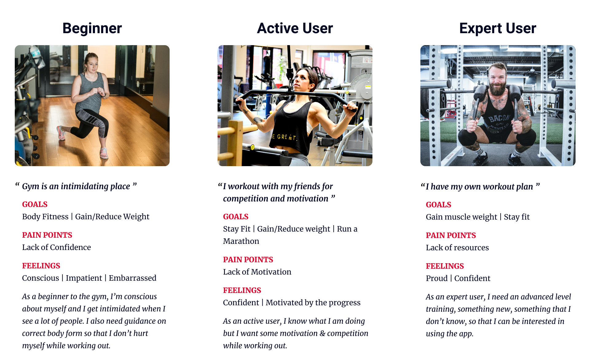
I identified the following 3 behavioral profiles on the basis of interviews
Journey Map
In the journey map below, I've shown the journey of an individual from "Conducting initial research" to "Tracking their workout and food intake". The users encountered major issues when going to the gym for the first time and working out
User Flow
With the help of User Flows, I understood how to link the user stories with the app and flow of the major functionalities of the design
Medium Fidelity
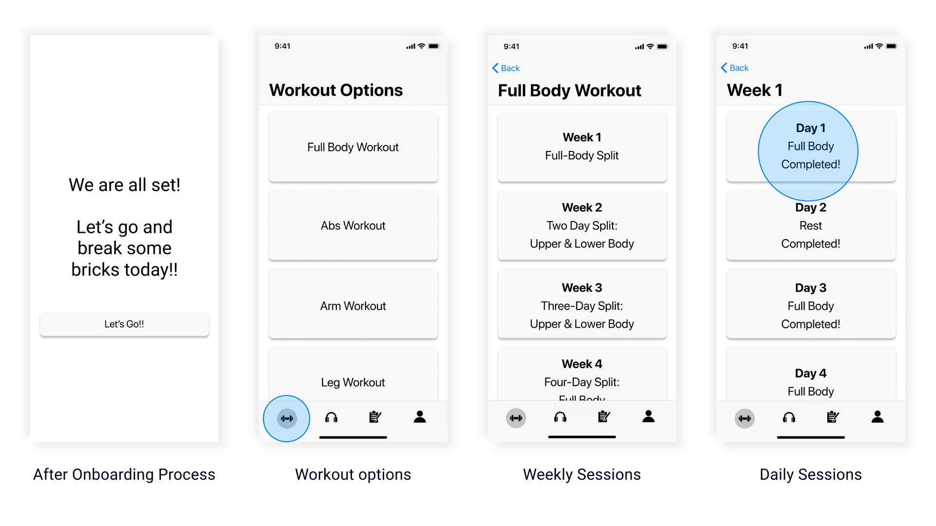
The design started to come alive with the medium-fidelity design. The major issues I was facing here were how to improve information hierarchy and user flow
High Fidelity Design
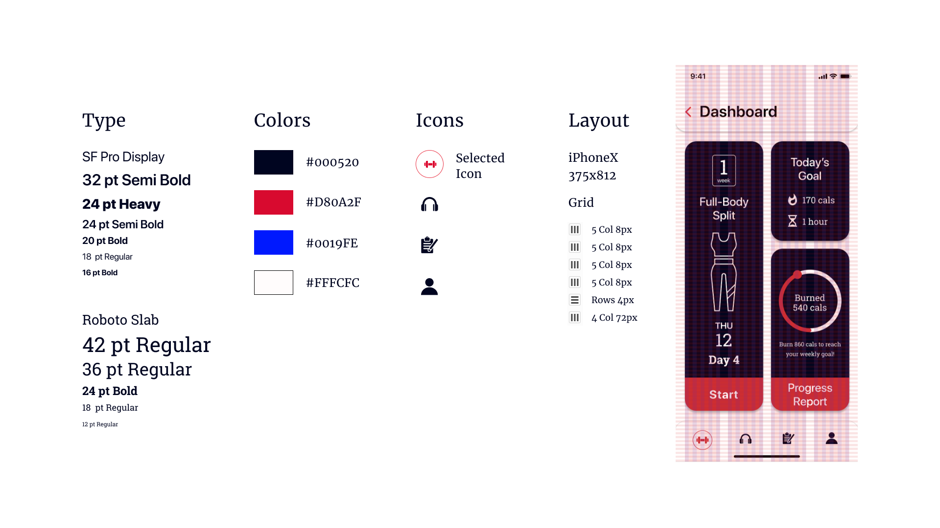
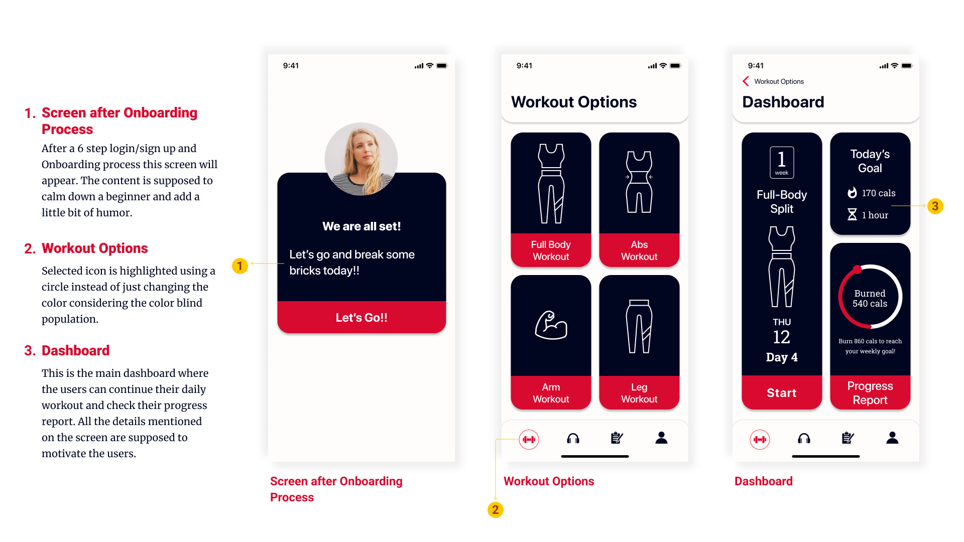
I finally tackled the information hierarchy problem visible in my Medium Fidelity Design. For my visual design, I used two different art directions: The Flash and Green Arrow. I made Mood boards, Inspiration boards and Style boards for both the directions and then decided to go with the "Flash" visual theme as it was based on heavy contrasts, motion and patterns. The color-blindness aspect came in here and I realized how we miss very small but important details while designing.

Apple Watch and Apple TV
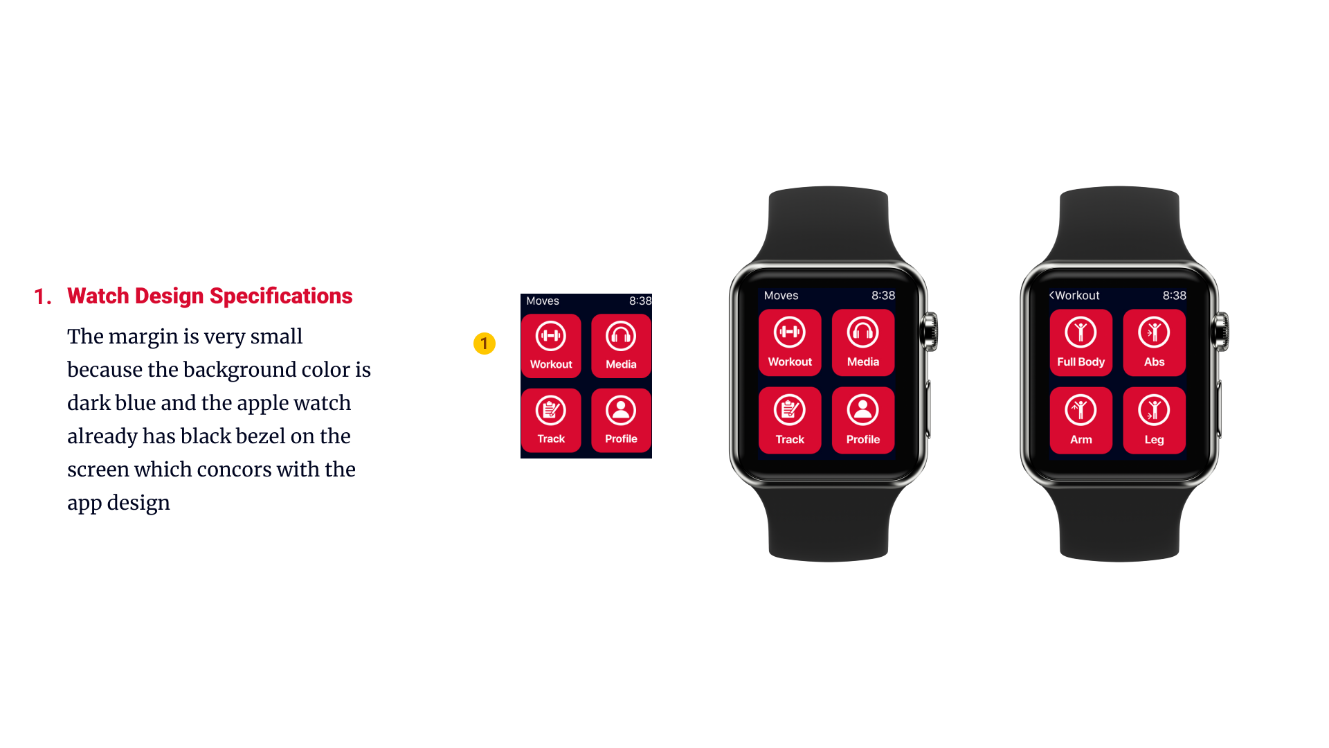
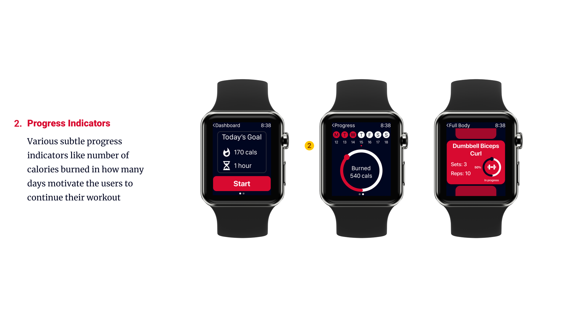
As we talk about fitness, just a mobile app proves insufficient. People own various gadgets like smart watch and smart TV and they want to use it. So, here's a design for Apple watch and Apple TV.
REFLECTION
I realized that it is not very difficult to design for accessibility. Conveying a message by using shapes and not just colors is the biggest takeaway. Next challenge was designing for various devices while keeping the same theme and connecting them to each other. Also, as this was an individual project and I learned a lot of new techniques and how to utilize them considering time efficiency and deadlines.
