OVERVIEW
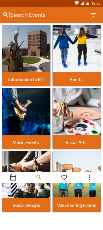
Design an experience for students to discover orientation events and craft a visual system to accommodate different types of events: sports, music, visual arts, social groups, and volunteering events. Provide high-fidelity mocks for searching, browsing, and viewing the details for these different events.
DESIGN QUESTION
How to improve the orientation experience for the new students and help them discover different types of events?
OUTCOME
High Fidelity prototype of a mobile app
RESEARCH
The initial research was divided into two parts, Interviews and a Study of Existing Systems.
Interview Insights
I took 7 interviews and got quite interesting insights from them. The key findings from the interviews are as follows:
"Some of the events were marked compulsory to attend. I attended all of them so that I don't miss important information"
"Want just one platform, either mail or RIT Mobile App for all the event notifications"
"App with notifications is more important for me"
"Came to know about applications during orientation"
Pain Points:
- Too many Mails
- Directions in college
- Going Alone/ Feel Awkward with unknown people
- Didn’t knew about the free stuff
Motivations:
- Get to know important details
- To meet new people
- Free Swags
- Good review for previous event by a friend
Existing Systems
From the interviews, I identified that there are 4 most commonly used systems that the students used for checking the orientation events and each of them have some advantages as well as some disadvantages as follows:
Features of Existing Systems
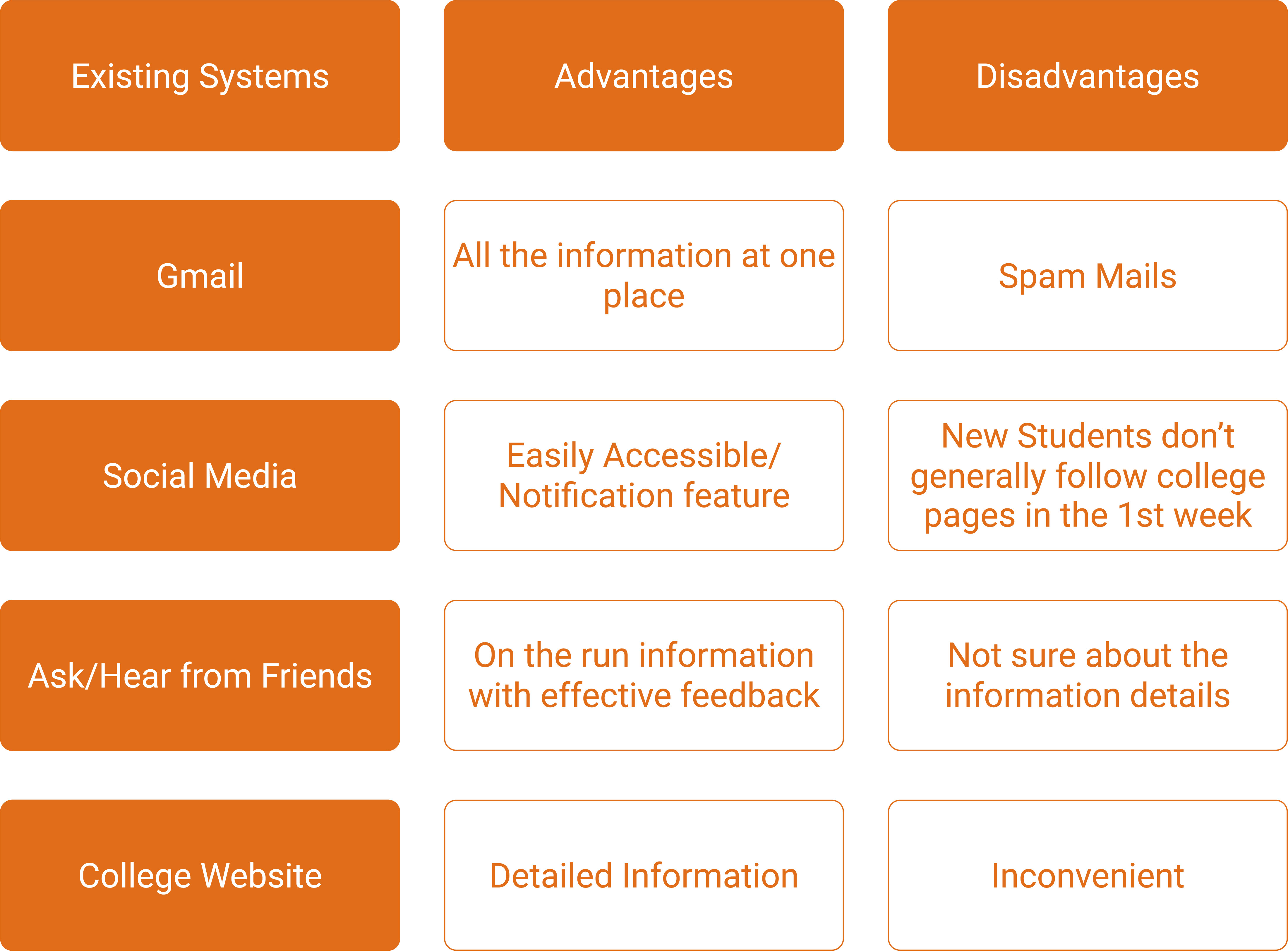
Apart from this, there is another mobile app called "Campus Groups" which shows the information of all the events and groups in college, but none of the students used it because of the a bad interface and bad user experience.
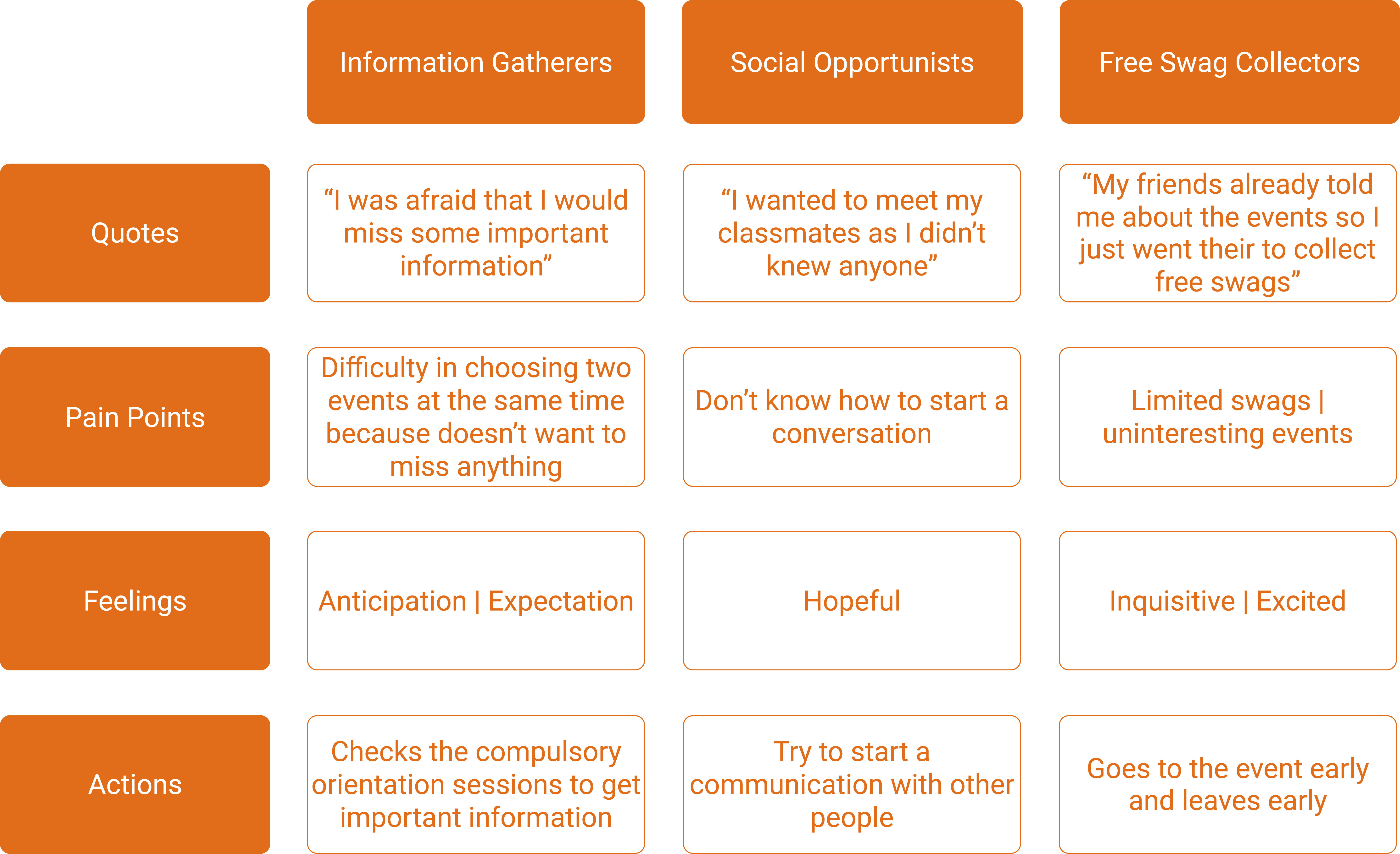
Behavioral Profiles
After the interviews, I realized that the individual profiles can be broadly divided into 3 types: Information Gatherers, Social Opportunists, Free Swag Collectors. Their characteristics are listed in the table below.
Behavioral Profiles
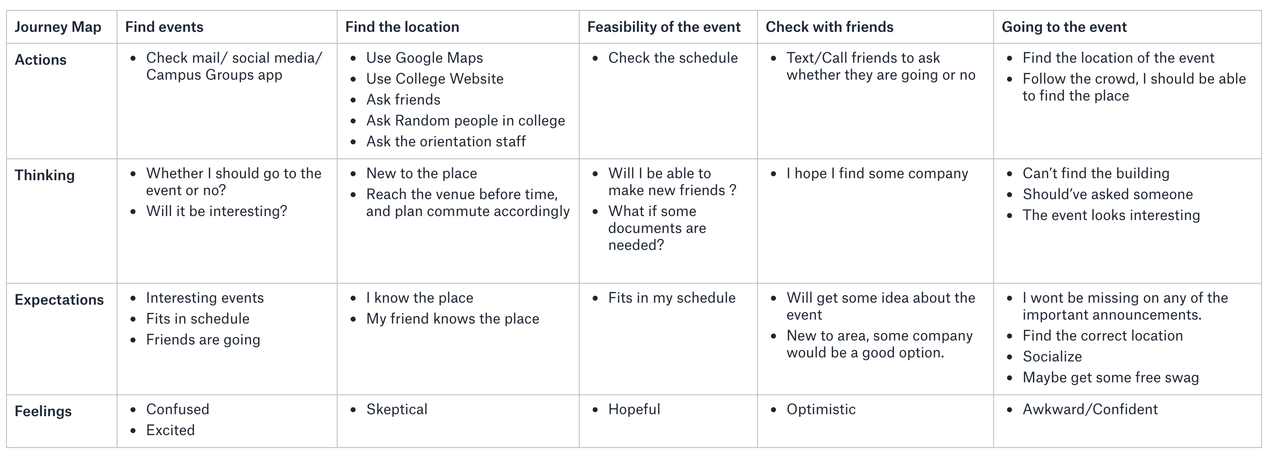
Journey Map
For me, Journey Maps make it easy to visualize the potential users of a product. In the journey map below, i've shown the journey of an individual from Finding an event to actually going to the event.
Journey Map
PROTOTYPE
UI Patterns
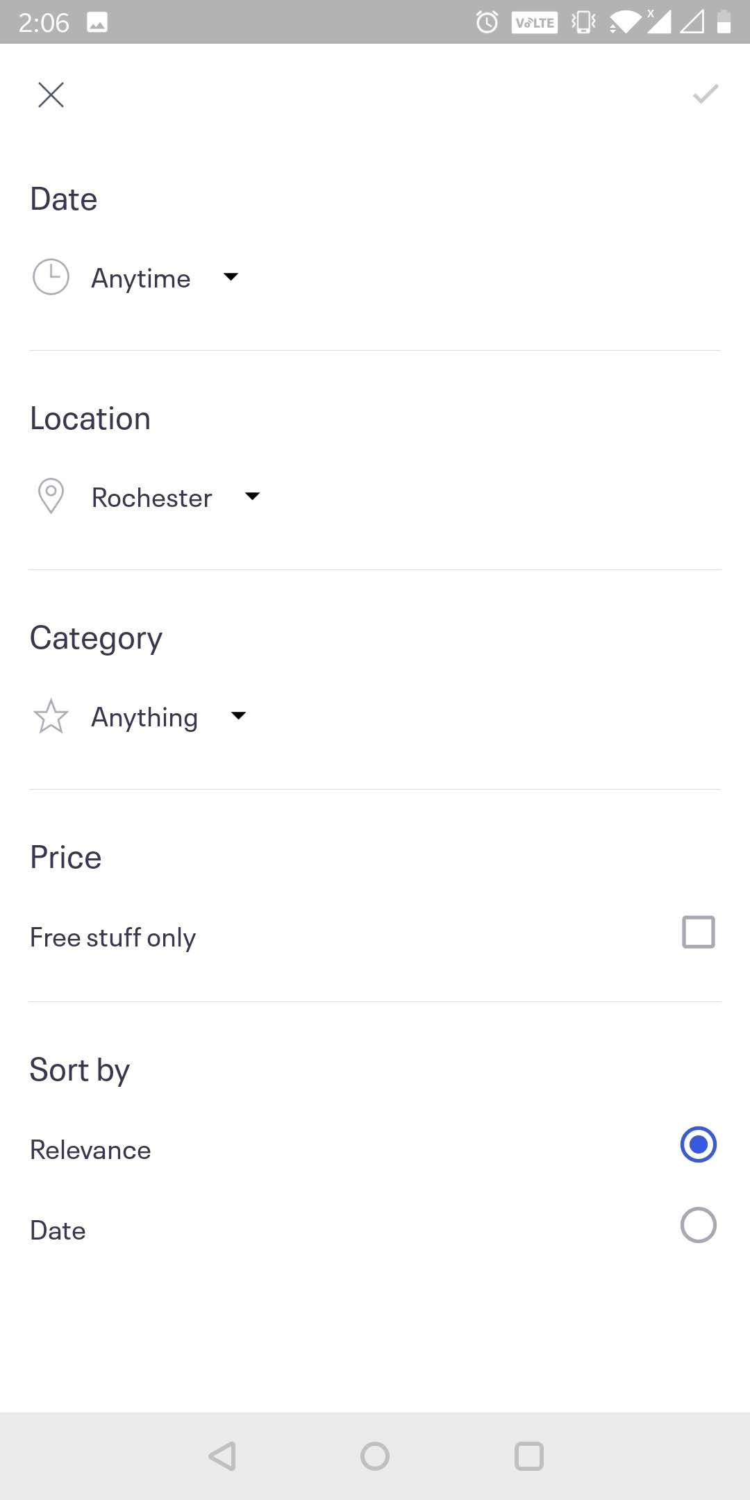
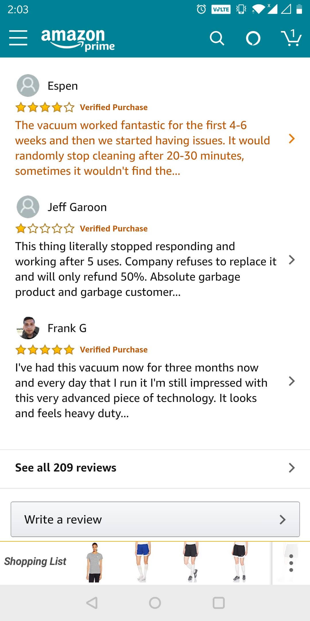
I started with the prototyping process by doing a competitive analysis of UI patterns of various mobile apps that provide information about different events. I liked the information architecture and overall simplicity of the design of Eventbrite app. The Filters page of Eventbrite is shown below. Then I checked out the Campus Groups app. I liked the content of the app but the GUI was not very interesting. I wanted to add "comments" section in my design and for that I refered to the "Write a review" section of Amazon mobile app.
Eventbrite Filters Page
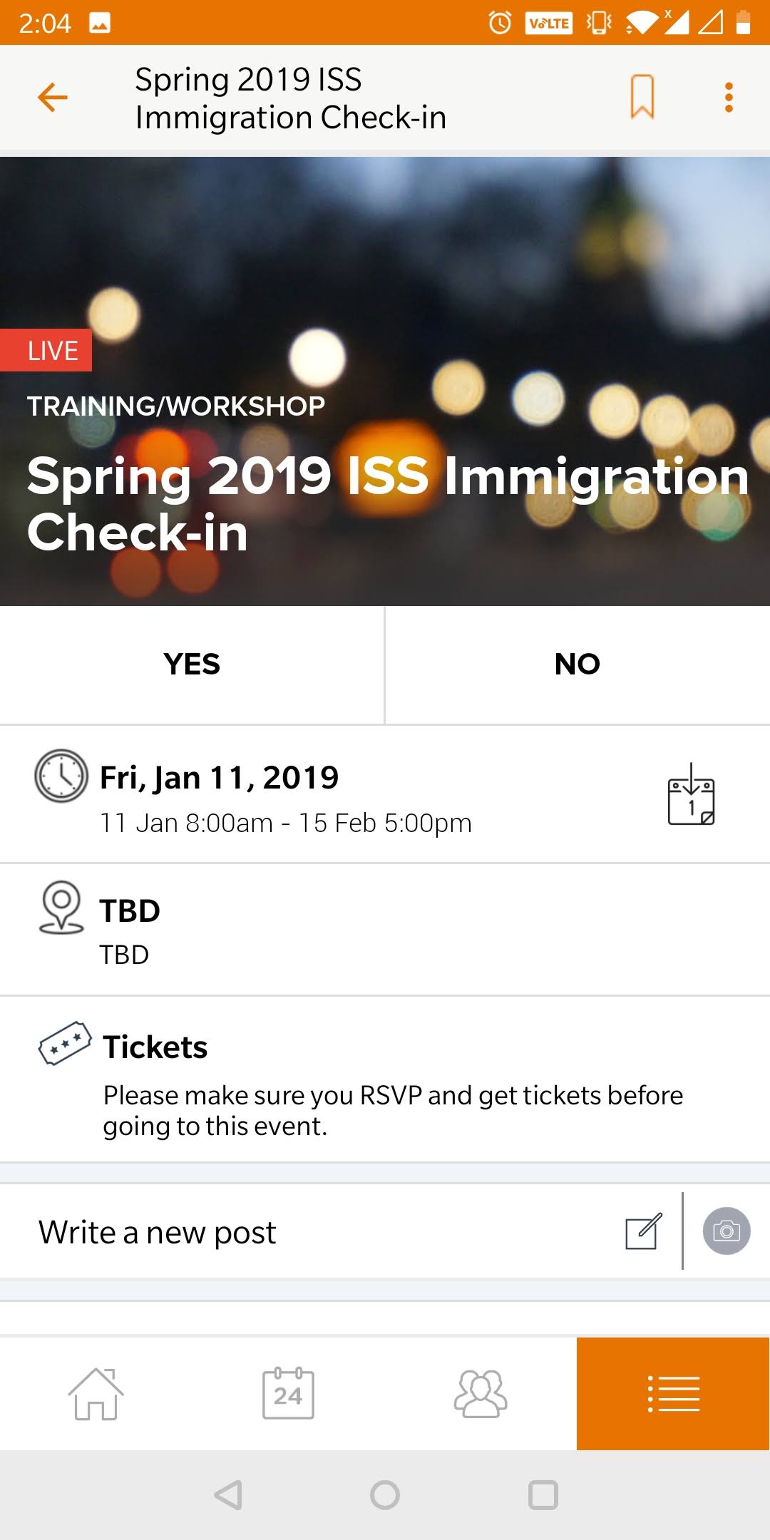
Campus Groups Events
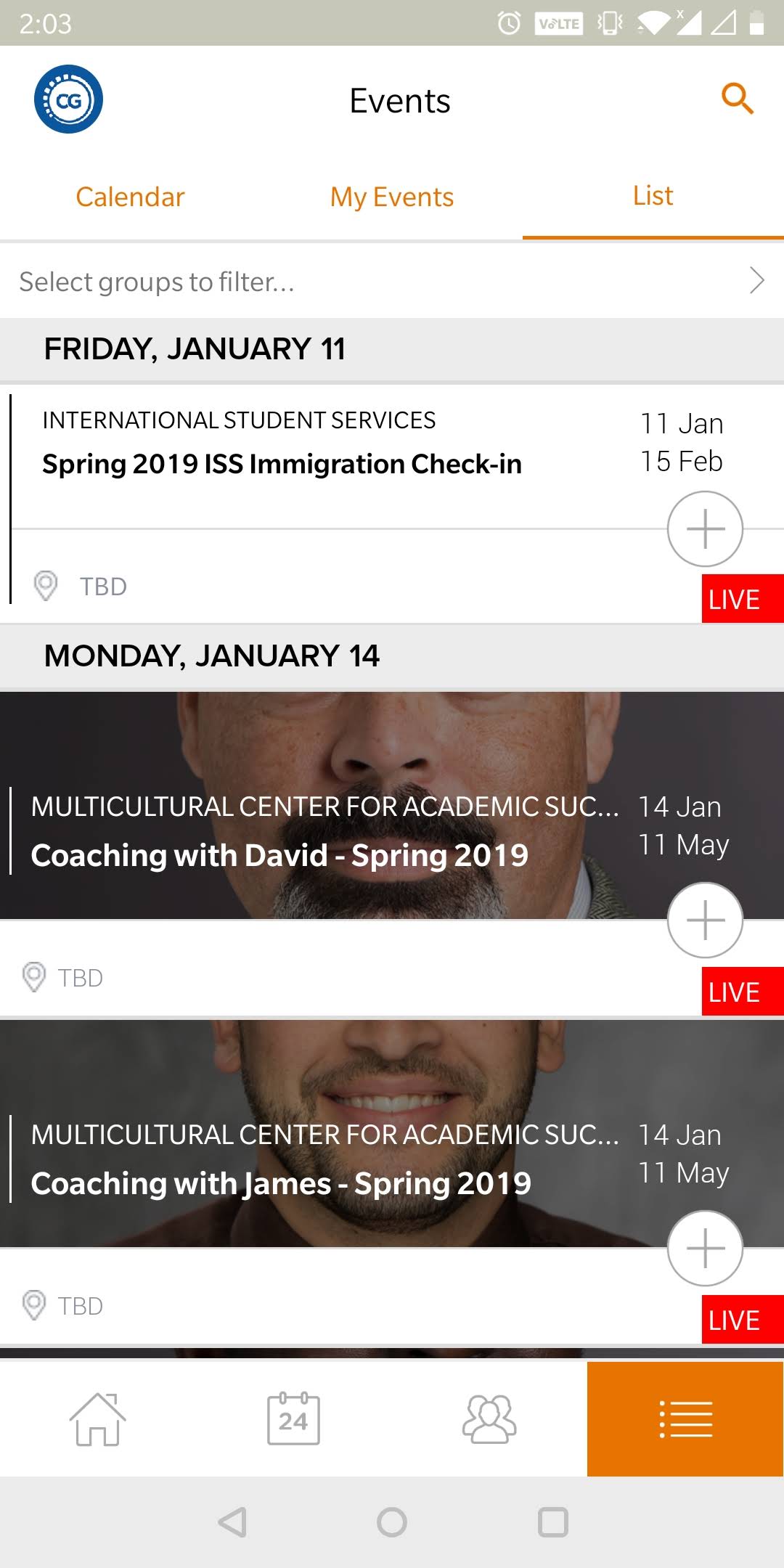
Campus Groups Events
Amazon Reviews
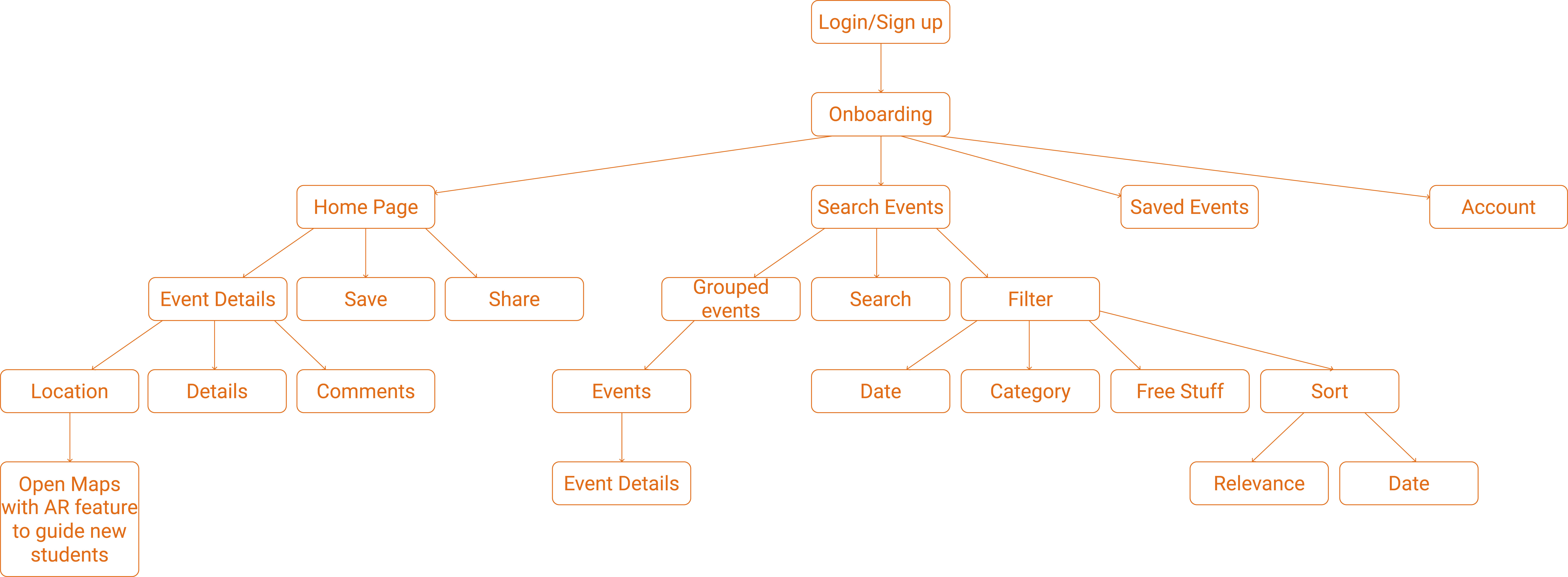
Information Architecture
After getting an idea of the flow, I combined my user research with the analysis of the existing systems and made an Information Architechture for my design.
Information Architecture
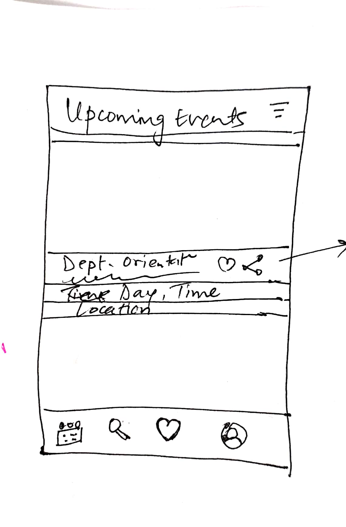
Low Fidelity Prototype
I actually first skipped the Lo-Fi and directly started making the Hi-Fi. After making 3 major screens, I asked an individual to do usability testing and there were a lot of issues with the design. I had spent a lot of time on the hi-fi design. So, then I decided to make a Lo-Fi and included all the changes from the first testing. Then finally worked on the Hi-Fi prototype.
1st Iteration: Hi-Fi Prototype
I used the concepts of Material Design for making the Hi-Fi prototype. Issues in this prototype according to first usability testing are as follows:
- "What are these three dots on the top for? Is it for filter?"
- "Why is the events page named as home page? I got confused."
- No details about the events on the first screen
- What is "Welcome to RIT"?
Lo-Fi Prototype
I used the results from Usability testing and made the Lo-Fi Prototype shown below.(Not very proud of it).
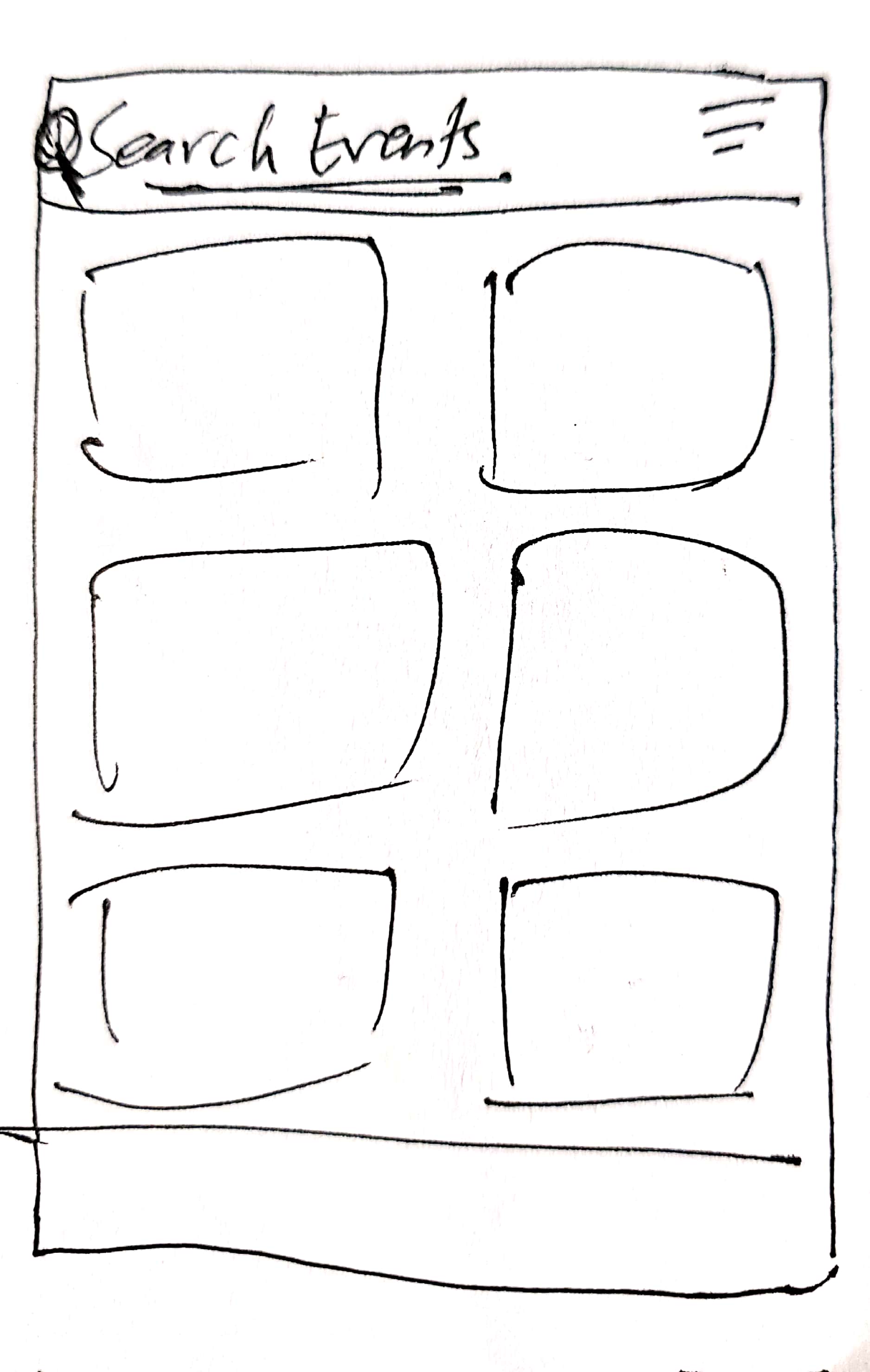
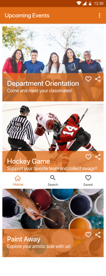
High Fidelity Prototype
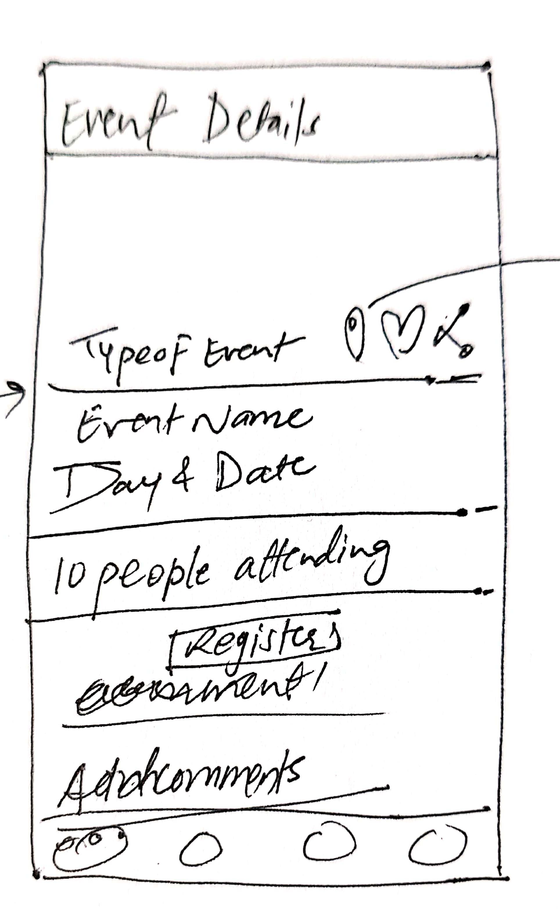
Features:
- No more spam Mails
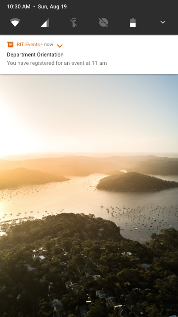
- Notifications before the event
- Share feature, give authenticated details to your friends
- Check the number of people attending the event
- Write a comment on the event and find friends and maybe some help
- Personalized display of events (From Onboarding)(Not implemented in design)
- Find locations easily using AR guide (Click "Location" in the event details)(Not implemented in design)
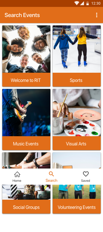
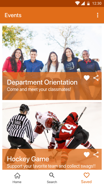
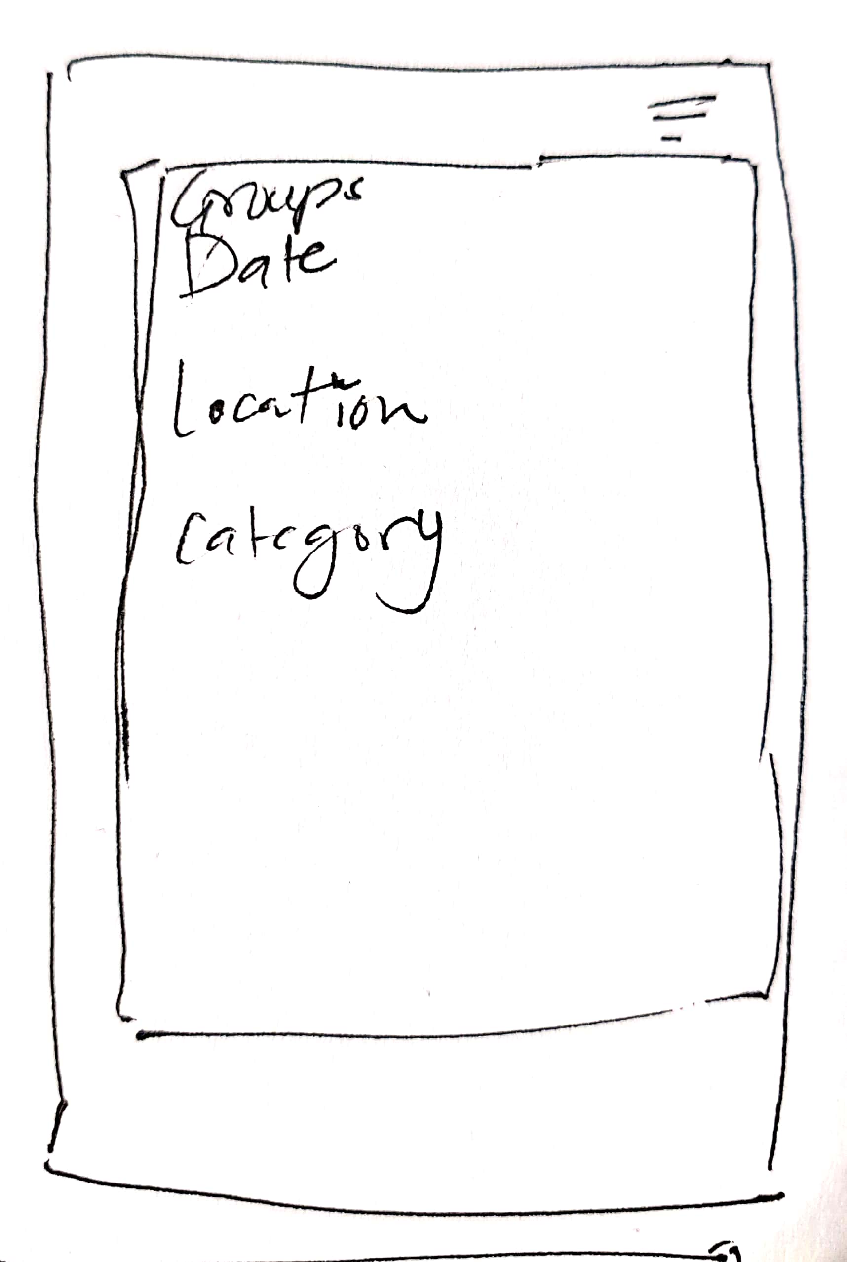
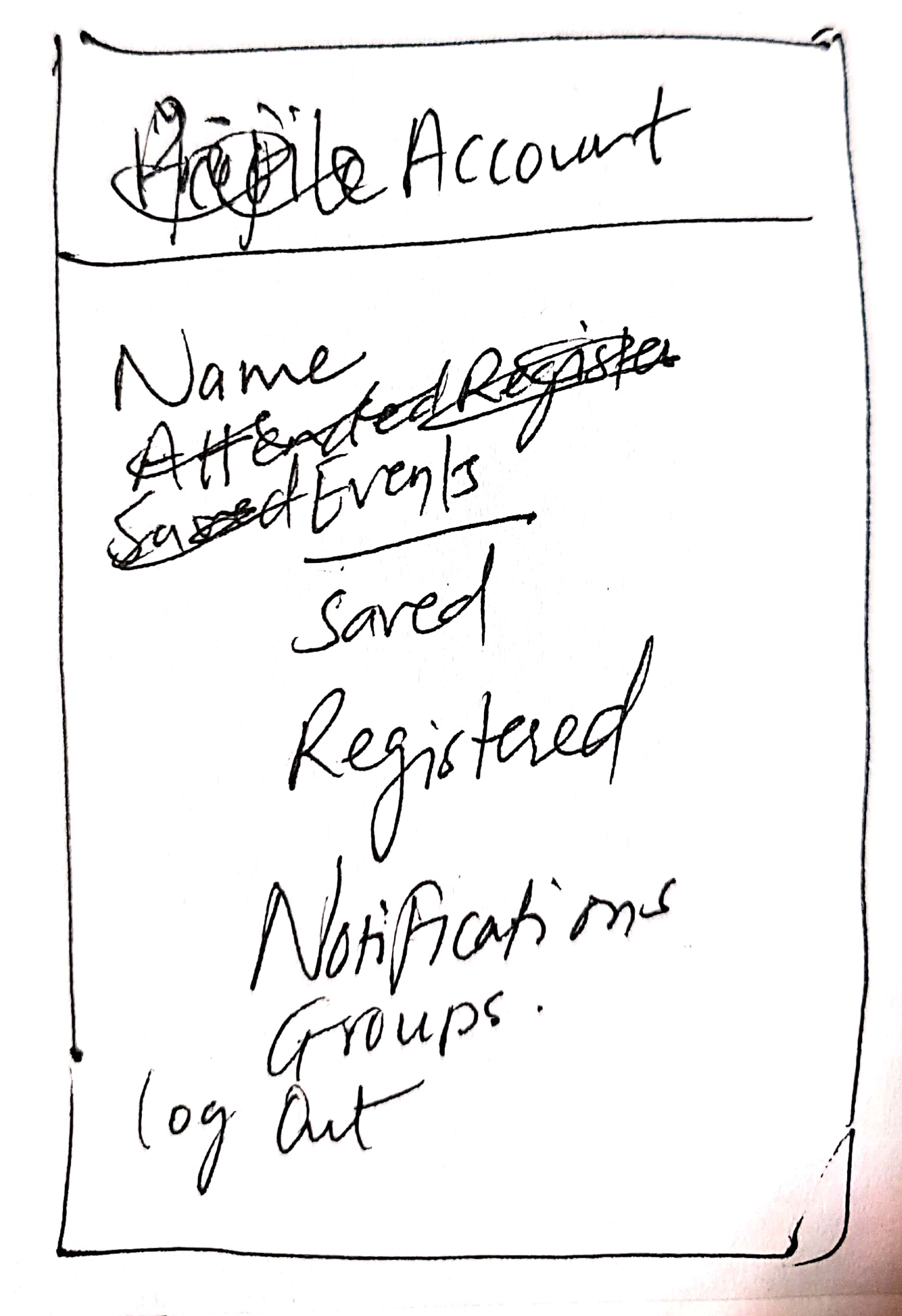
2nd Iteration: Hi-Fi Prototype
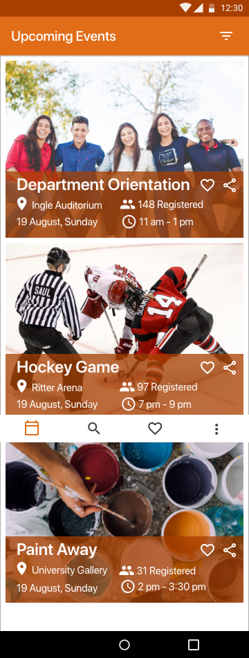
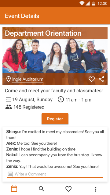
- The number of participants acts as a motivation for students to attend the events
- Important information is displayed on the first screen itself
- Using the "Write a Comment" feature the user can ask for more details or find some friends!
- Changed "Welcome to RIT" to "Introduction to RIT"
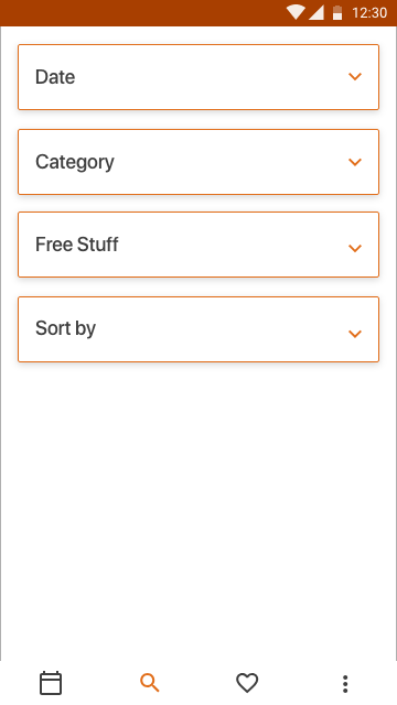
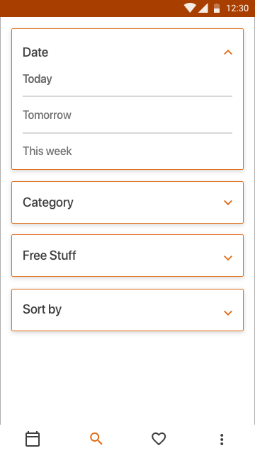
- Instead of giving all the information on one screen on filters screen, I categorized it and the user can click on each category for finding the filter they want
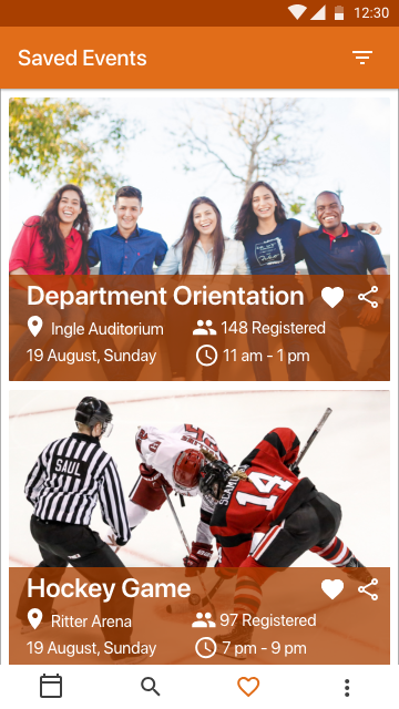
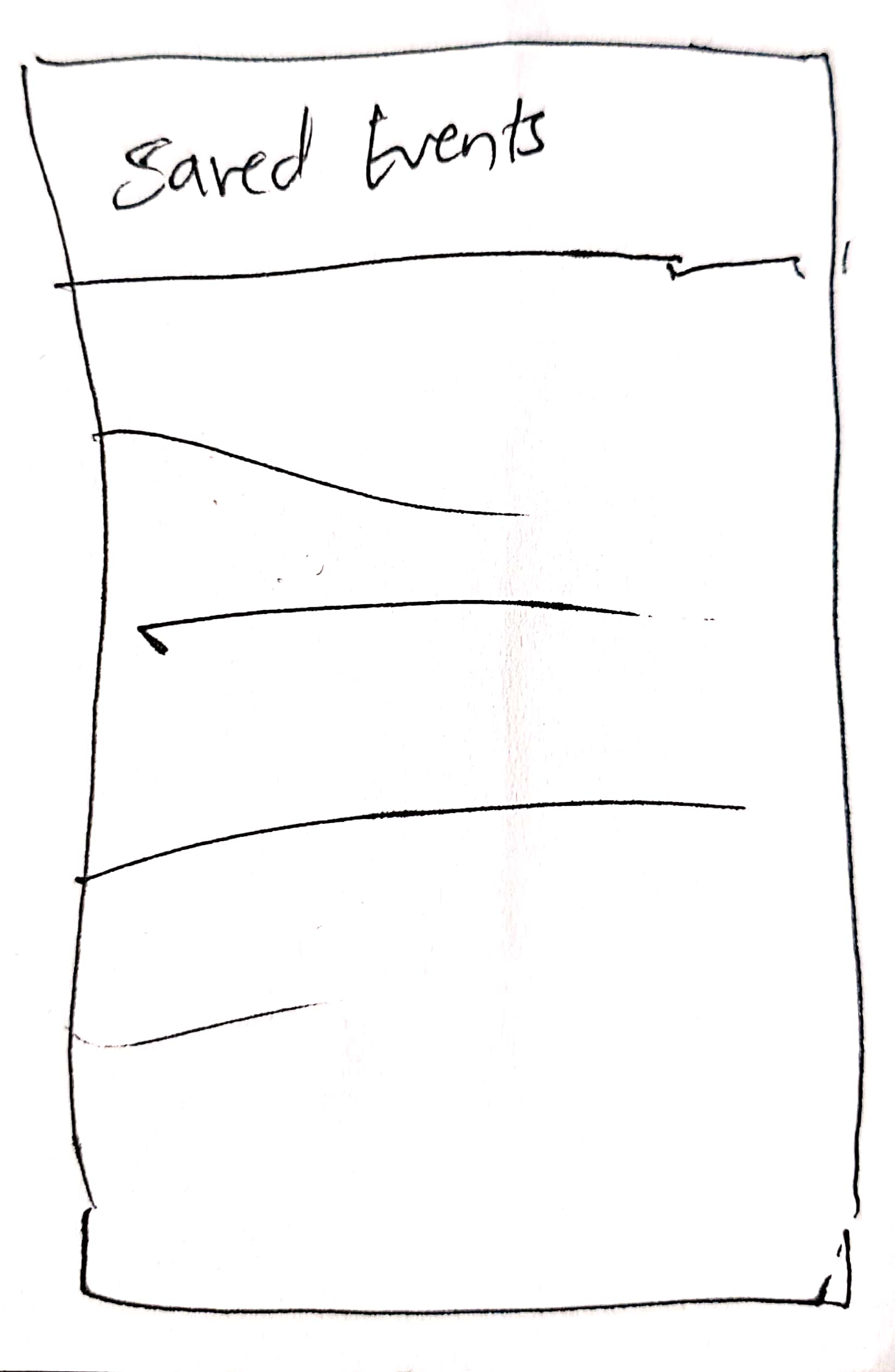
- The user can save the events they are interested in
- They will get a notification for the Registered and Saved events
Some Characteristics that I wanted to Include in the Design
- Onboarding: Here some questions will be asked like "What are your Interests?" and options will be displayed, for example, "visual arts, sports" and then the events on the home page will be displayed according to their preferences.
- Location:Almost in every interview, the participant claimed to have faced the issue of finding the location. It is really important point because the University campuses are very huge. The best design solution I could think of is "AR Guide". So, when the user clicks on the location tab, a camera screen will open up and it will guide the person using some AR indicators.
REFLECTION
This was a really great experience. Managing the competition with my courses was a difficult task but that's when I understood the importance of time management. First I tried to implement all the concepts that I learned in the last 5 months but then I understood that I need to choose one path and go on it.